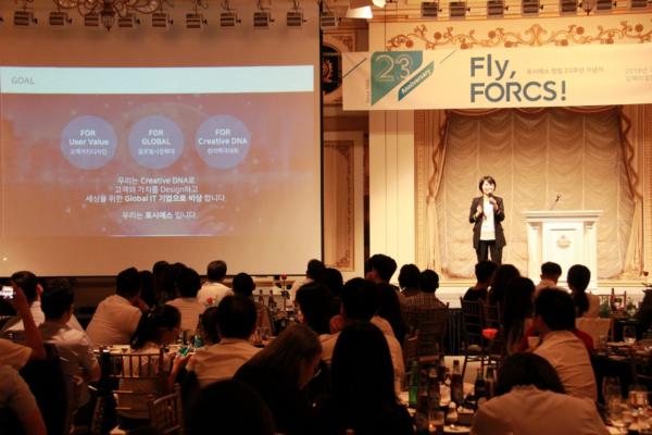
FORCS 23rd Anniversary – New Corporate Identity
We celebrated our 23rd anniversary and launched our new corporate identity on 25 July 2018 at the Imperial Palace Hotel in South Korea. The new logo shows a bird flying, signifying the entrepreneurial spirit of the company – constantly creating breakthroughs in paperless technologies. It also signifies the strengthening of relationship with our customers, taking the company to greater heights.
![]()
The curvy font used represents creativity and flexibility, giving people the feeling of harmony and balance. It also communicates the message of a work-life balance corporate culture. The new colour “FORCS Blue” is blended with green, a natural and soothing colour that conveys reliability and sophistication.
“This new corporate identity clearly communicates our intention to take a leap forward as a global company, we aim to achieve new growth with our newly launched cloud-based eForm service and aim to introduce beneficial disruptive technology to further improve lives.” said Park Mi Kyung, President and CEO of FORCS.
The annual appreciation dinner is to thank FORCS employees for their hard work for the company. Employees who have been with the company for 5, 10, 15 and 20 years were awarded and recognized for their commitment. As part of our corporate social responsibility, donations were made to the World Human Bridge and Korea Leukemia Children’s Foundation.