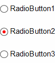
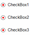
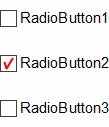
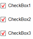
Check Style
Check box style of RadioButton or CheckBox.
Check Style property changes check box shape and check mark symbol. For instance, even if changing Check Style of a RadioButton to Check from Radio, the mutual exclusive choice won't be changed.
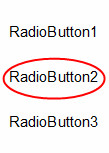
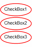
If you set this property value to Circle, only the text is displayed without a frame. If you check the checkbox, it displays a circle. Circle will be displayed inside the margin by 3 pt in the component and the border color is displayed as Check Mark Color and border thickness is displayed as 1.5 pt. If you save reports in xls of mht format or html or mht format circle will not be saved.
Example
Check Style |
RadioButton |
CheckBox |
|---|---|---|
Radio |
|
|
Check |
|
|
Circle |
|
|